
Brand Guidelines
Welcome to the Flexport Brand Guidelines, your central hub for exploring our brand identity system and downloading official brand assets.
Foundations
Introduction
These brand guidelines serve as the definitive reference for how Flexport presents itself to the world. Inside, you'll find everything needed to represent the brand with clarity and consistency — from our mission and company values that ground every decision we make, to the precise rules governing our logo, F-mark, and sub-brand lockups.
The guidelines cover our full color system, including core colors, tints, and gradients, alongside our primary typeface and typographic hierarchy.
Whether you're designing for digital or print, this document is your starting point. Consider this a living document—it will be updated often with new assets and directions, so please check back regularly for the latest version.
Our origin story
It all started with scooters. Before Ryan Petersen founded Flexport, he ran a small e-commerce business with his brother that imported electric scooters from China to sell on eBay. He quickly realized he was at the mercy of the opaque and complex world of global trade: “I had the distinct feeling that every forwarder was ripping me off.” Global logistics was a black hole. Your stuff disappeared for 30 days and when it reappeared, you got a giant bill you weren’t expecting. The big players know what’s happening in the freight markets and use that information to their advantage, leaving everyone else in the dark. No business owner can compete with that. Flexport was founded to fix it.

We believe that global trade moves humanity forward
Every shipment represents someone’s livelihood, a business’s ambition, or a community’s access to goods they couldn’t produce on their own. Flexport exists because we believe that when trade flows more freely, the world gets better for everyone.
Make global trade so easy there will be more of it
Our mission is both a promise and a standard. We move goods, but more importantly we remove the friction, complexity, and opacity that has historically made global logistics one of the hardest things a business has to manage. By making trade easier, we unlock growth for businesses of every size and increase the total volume of global commerce and prosperity.
Flexport is building the autonomous operating platform for global trade
We’re building AI & technology that empowers brands to automate and optimize their supply chains from factory floor to customer door or retail store, leveraging Flexport’s freight and fulfillment operations, customs brokerage, financing services, and AI technology to deliver cargo on time while saving money. Our AI sees problems before they happen, calculates the fix, and executes it, turning reactive logistics into a predictive, self-optimizing system. Our vision is an autonomous supply chain that improves with every shipment, that enables businesses to focus on creating amazing products and reaching their full potential.
Brand Proposition

Flexport automates and optimizes global logistics from factory floor to customer door – making it easy for you to ship anywhere, sell everywhere, and grow faster.
What makes us different
AI built for the real world of logistics
Flexport’s AI intelligence is embedded in every layer of operations: predicting delays before they happen, optimizing routes in real time, catching duty savings automatically, and preventing stockouts before shelves go empty. Our AI delivers proven, measurable results for customers today. Our algorithms have recovered $900M+ in duty drawback and tariff savings and saved customers an average of 10% on freight costs.
End-to-end logistics with one partner
A single partner and platform for visibility, control, and unified communication across everyone who touches your shipment, from origin to final delivery, by plane, ship, train, or truck. Integrated with your ERP and connected to e-commerce marketplaces to manage a single pool of inventory from order to cash. A single pane of glass allows you to optimize your complete supply chain, while removing costly siloes.
World-class operations and quality are our foundation
Flexport is a leading freight forwarder, customs broker, and fulfillment provider with the infrastructure and expertise to move your goods around the world. We deliver the highest quality with cost savings because our execution is powered by deep historical data and an AI operating system.
We win together
When you win, we win. Our team works as an extension of yours. We know your name, your lanes, and your deadlines. We adopt your goals as our own. Whether it’s improving on-time performance, minimizing duty payments, or promising 2-day delivery with confidence, our people make it happen, augmented by AI that helps them see further and act faster.
Company Values
Play the long game
There are no shortcuts. We operate with integrity, putting safety, compliance, and long-term customer trust ahead of short term gains.
Empower the client
Customer obsession is the foundation of our culture. We are successful only when our customers are winning consistently.
Act like an entrepreneur
We are principled entrepreneurs who live in reality but are never satisfied with the status quo. We are endlessly curious and constantly seek to create meaningful change.
Simplify
We turn complexity into clarity. We challenge assumptions, eliminate unnecessary steps, and streamline processes to create reliable, scalable solutions. We communicate clearly and concisely and celebrate simplicity.
Win as a team
We solve problems for our customers as one global team. We break down silos, collaborate across departments and time zones, and never let hierarchy or bureaucracy stand in the way of doing what’s right.
Voice & Tone
Aspirational
We believe in building big things, and the things we build have the power to connect the world. We aren’t naive, and none of our plans require miracles. We believe that with focus, tenacity, and vision we will build the future of global trade. We are ambitious, but our goals are founded in reality and action.
We are: Human-centric. Digital and physical. Sustainable. Positive-Sum. Globally-minded.
We are not: Trendy. Tech-only. Pollyanna.
Knowledgable
We speak with deep subject matter expertise to help empower our customers. We value knowledge and learning to be a leader in our industry. We translate data into decisions, and AI insights into actions, and we are constantly building to improve our industry through technology. We speak with precision, sources and data to support our claims, opinions, and hypotheses. We are educators, but we do not sit in an ivory tower. We are not overly academic, we translate for everyday reality and action. We don’t need to be the smartest in the room; we should make the room smarter.
We are: Data-driven. Forward-thinking. Insightful. Advisors. In-the-know. Translators. Trusted. Proactive.
We are not: Superior. Elitist. Academic. Overly confident.
Human
Trade is fundamentally human, and so are we. We speak as professional partners who are in your corner. AI can feel abstract, so we make it concrete, practical, and connected to outcomes that matter. We take our customers' businesses seriously, and we lead with understanding and empathy. It doesn’t take a PhD or glossary of terms to understand us, which means we do not speak in complex industry jargon and acronyms. We work with businesses of all sizes and strive to be approachable. Our tone should be engaging and encourage dialogue. We don’t take ourselves too seriously, but this doesn’t push to the side of “funny” or “irreverent.”
We are: Concise. Genuine. Forthright. Transparent. Context-conscious. Professional. Real. Authentic.
We are not: Insiders. Technical. Cryptic. Philosophical. Domineering. Casual. Silly.
Builders
We're building the future the industry knows is inevitable. We earn trust through results: provable cost savings and measurable reliability. We’re confident because we have evidence that our technology will set the world standard, but we are open-minded and humble, always willing to learn more and iterate. We are respectful, but bold. We never punch down, we lift the industry up. We actively challenge the status quo and move forward with velocity (not just speed).
We are: Innovators. Customer-centric. Curious. Truth-seeking. The proven modern standards. Doers who ship results.
We are not: Comfortable. Complacent. Legacy. Confrontational. Disruptors. The risky upstart. Software without substance.
Logo
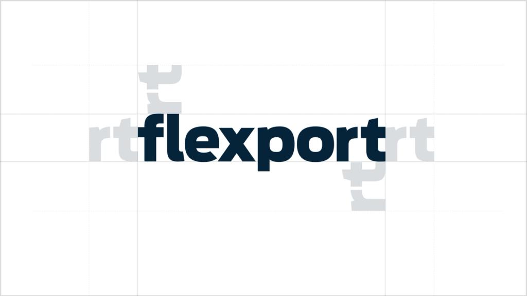
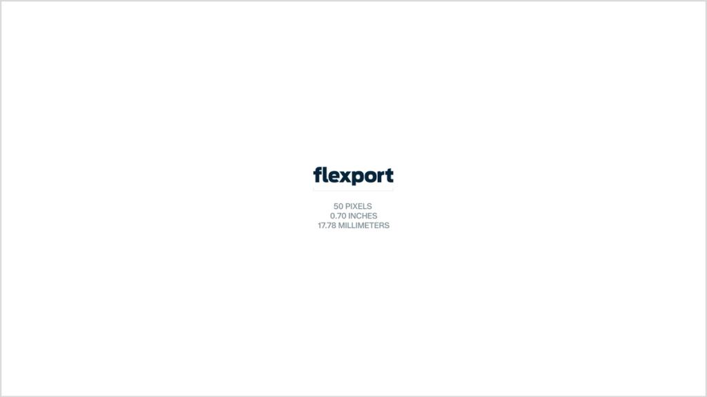
A logo is the most visible representation of a brand. Our logo is a wordmark of our full name, which helps us continue to build awareness and consideration for Flexport globally. The Flexport logo is crafted from bold, lowercase, rounded letterforms. Together these elements help convey approachability, boldness, and structure.
Using the logo exactly as outlined in these guidelines ensures a consistent brand experience.
Favicon
Our icon should only be used as a favicon and not for any other purpose. The dark version should be placed on Cloud White backgrounds, while the light version should be placed on Midnight Blue or Jet Black backgrounds.
Incorrect usage
The Flexport logo should never be stretched, rotated, outlined, gradient-filled, re-typed in Antenna, combined with the favicon, or generated by AI. Product names must not use a different font.
Sub-brand Logos
To maintain visual consistency across our global presence, we use a unified design system for all product and event branding. Sub-brands must follow our standardized lockup templates to ensure clear alignment with the parent brand.
Note on Location Badges: Legacy office and warehouse location badges are officially out of brand and should no longer be used or published publicly.
Sub-brand logo types
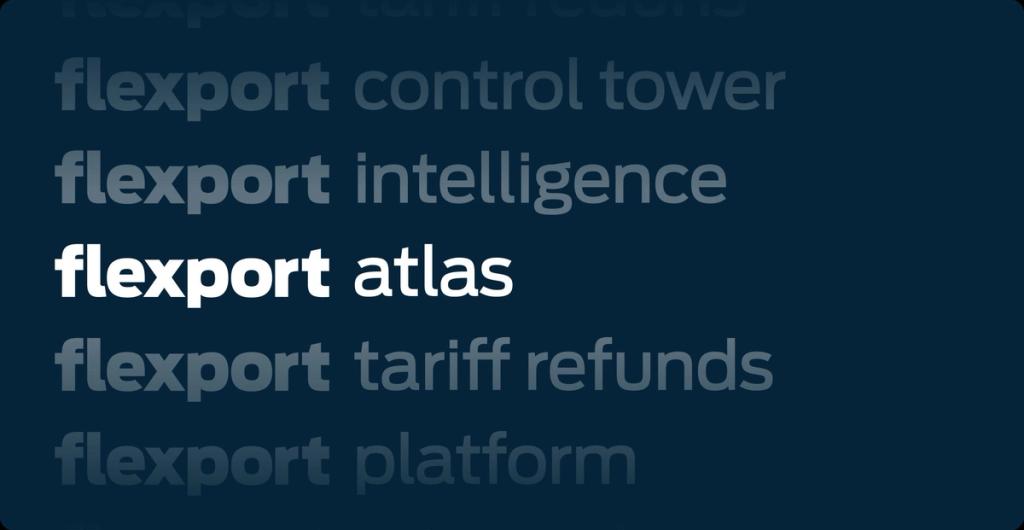
Sub-brand logos must use descriptive names that clearly identify their specific product or event. Avoid cutesy or abstract naming to maintain clarity across the brand, e.g. flexteams. Only the Brand Team is authorized to create official logos. If your project requires a new sub-logo, please submit a request to the Brand Team.
In-product only: Antenna Medium, tracking -3%, Midnight Blue or Jet Black.
Events: Antenna Black, tracking -2%, Midnight Blue or Jet Black with a single color from the secondary palette.
Color Palette
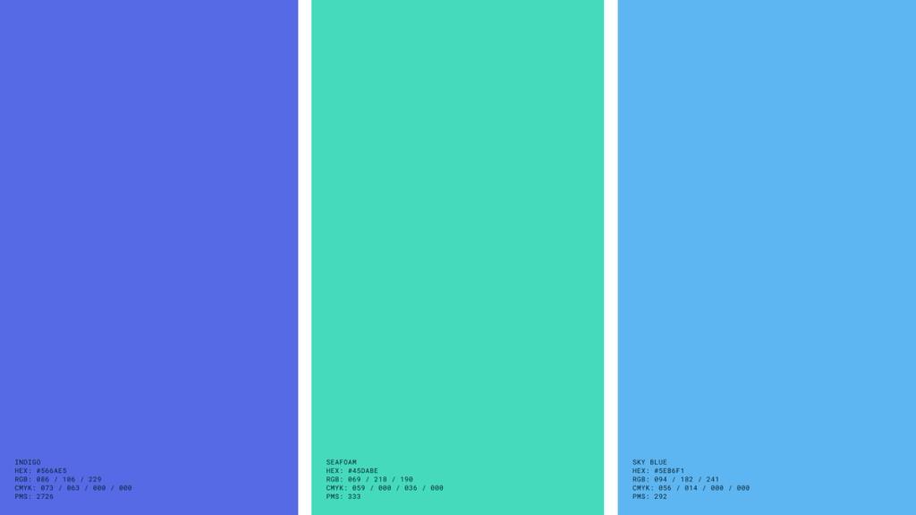
Our palette is rooted in the physical world of global commerce. Together, the core colors provide a subtle nod to the environments of trade—land, sky, and sea. This foundational set allows for a cohesive aesthetic that remains versatile for both print and digital applications.
Primary Palette
Midnight Blue and Cloud White form the foundation of the brand across all touchpoints. Together, they create a bold, high-contrast pairing that works equally well across digital and print applications.
Secondary Palette
The secondary palette extends the brand's visual range with a curated family of blues and greens that echo the environments of global commerce. Each color is available across a range of values, from rich, saturated tones to lighter, offering flexibility without losing cohesion.

Shades and tints
Each palette color is available in a full range of shades and tints. The lighter tints are intended primarily for functional UI purposes — backgrounds, hover states, dividers, and surface fills. The darker shades are used for text on white or light backgrounds, ensuring strong legibility and contrast across all applications.
Gradient
Inspired by the shifting tones of the sky, the gradient reflects the seamless movement of cargo from origin to destination. It is used sparingly as a background where added visual weight is needed.
Status & Alert Colors
These colors are reserved exclusively for data, chart reporting and website or product states. Unlike our primary and secondary palettes, these colors are not brand identifiers and should never be used as dominant design elements in public-facing marketing, advertising, or general brand layouts.
Warning: used for warning states, system delays, or pending statuses that require attention but are not system-blocking.
Error: used for critical errors, system alerts, blocked workflows or supply chain disruptions.
Typography
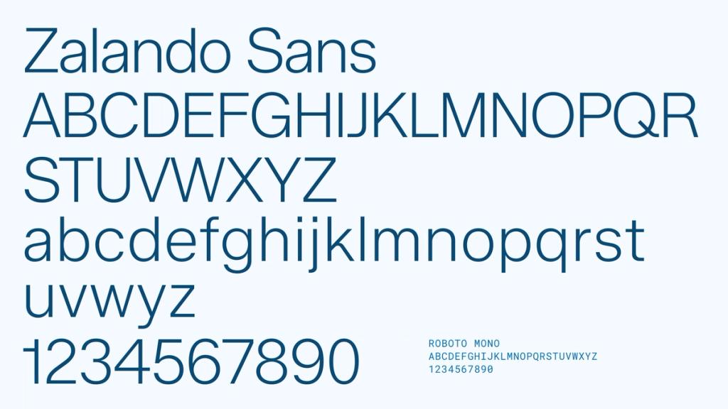
We use two typefaces — Zalando Sans for content that needs to be read, and Roboto Mono for the small structural details that frame it. Together they give Flexport a clear voice: modern, deliberate, and easy to follow at any scale.
Zalando Sans
Zalando Sans is our primary typeface — used for headings, paragraphs, and most copy across our website. Its slim, modern character (especially in the ExtraLight and Light weights that anchor our headlines) feels confident and contemporary without shouting. We pair it with generous line heights to keep content readable at every size, and treat it as the default voice of our brand.
Roboto Mono
Roboto Mono is our accent typeface — reserved for eyebrows, CTAs, and small structural details. Its monospaced characters and uppercase treatment add a precise, system-like quality to the brand — a quiet nod to the data, code, and schedules that power our work. We use it sparingly but consistently, as the punctuation around our main content.
Typesetting example
Good typography adds clarity to what we say and confidence to how we say it. The example below shows a type scale applied to Flexport messaging — use it as a general guideline for how to treat different hierarchies across every level. You may need to make specific optical adjustments based on the medium (print, digital, presentation) and size at which the text will appear.
Eyebrow
A short label that signals what a section is about. Always set in Roboto Mono, uppercase, tracked +5% — typically no more than a few words.
Headings
The primary voice in a layout. Always set in Zalando Sans — Extra Light for large-scale hero headings, Light for smaller subheads — with sentence case in tight letter spacing to read well at large scales.
Body Copy
The main text style for longer content. Always set in Zalando Sans Light with a line height of ~120% for readable paragraphs at every size.
Typography in Action
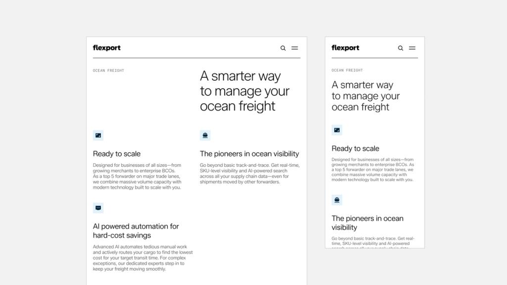
Our typographic hierarchy is designed to remain clean, intentional, and highly legible across any canvas layout. The examples below demonstrate how headlines, eyebrows, and body copy can adapt to various content densities—from low-text title slides to dense multi-column layouts.
Grid System
Our grid system is the underlying rhythm behind every layout we create, ensuring consistency across all brand touchpoints. It’s built on the same 8-point system that anchors our entire design system.
Whether defining columns on a website, aligning text boxes on a marketing slide, or establishing margins on a corporate document, adhering to this system ensures a flexible and harmonious approach to content layout.
Website
In our design system every column, margin, and gutter resolves to a multiple of 8. This structure gives us a modular approach to stacking content in our page designs. This system also supports the 2-up and 4-up arrangements that a lot of our modules in the design system use.
Desktop & Tablet: 8 columns with 24px margins and gutters. Mobile: 4 columns with 24px margins and gutters.
Presentations
Presentation slides inherit the same foundational 8-column structure as our desktop website layout. To accommodate data-heavy decks, we introduce horizontal rows to establish a layout grid. This provides clear alignment axes for charts, images, and secondary graphics, ensuring they cleanly anchor alongside our narrative slide text.
Social
Social media graphics require maximum layout flexibility to support a diverse range of aspect ratios, such as 1:1 squares, 4:5 verticals, or 9:16 stories. For these mobile-first environments, we implement a 4-column framework anchored by generous 80px margins and gutters. This oversized spacing logic provides an intentional safety buffer, ensuring that when the layout scales down onto mobile viewports, the content maintains adequate breathing room and never feels cramped.
Documents
Multi-page assets like US Letter or A4 documents translate our system into a flexible 8-column layout. We introduce an intentional 48pt outer margin—equivalent to 0.66" or 17mm—paired with 24pt gutters (0.33" or 8.5mm). This amplified spacing functions as a production safeguard against physical binding constraints and printer grip tolerances, ensuring typography doesn’t get clipped.
Motion
Flexport moves things — globally, predictably, and without friction. Our entire brand ecosystem should feel the same way. See below for core examples of how motion brings our brand to life across all mediums.
Moving from A to B
“Moving from A to B” anchors our motion design in the concept of progression. By animating elements from origin to destination, we visually reinforce the idea of forward momentum. This is seen in micro-interactions like our website buttons, and on a larger scale through staggered reveals across graphics and other layouts.
Text Reveals
Typography should introduce itself in deliberate steps rather than abrupt transitions. Headlines, text blocks or assets should use a smooth fade-in combined with a subtle upward shift, while technical eyebrows animate in with a precise ticker effect.
Data in Motion
Data in motion should always feel accurate, active, and data-driven. Whether visualized abstractly through particle flows or literally through stepping metrics, dynamic animation transforms static numbers into powerful, fluid stories of global connectivity.
Art Direction

Iconography
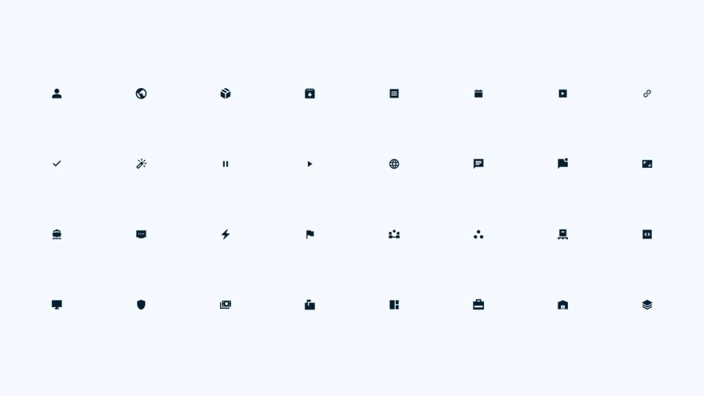
Our iconography is designed for maximum clarity and utility. They should be used to simplify complex information, never as pure decoration. To ensure consistency and readability, always provide enough breathing room around icons and keep consistent sizing across groups of icons.
Icon colors and framing
Our icons live inside a square frame rather than floating on their own. Each glyph sits centered on a solid background color, giving it a consistent visual weight wherever it appears. We use four variants: black, indigo, navy, and white, each paired with its own background tint so the icon stays legible on light or dark surfaces alike.

Iconography in Action
Icons carry a lot of weight in our system, they orient people fast and add clarity without adding clutter. The examples below show how icons scale across layouts, from a simple four-icon row on a title slide to denser, multi-column decks where icons anchor each section.
Photography
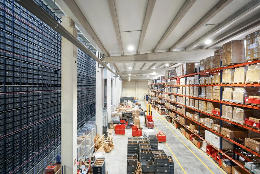
Photography is how we bring real human stories and scenes of global trade to life. Whether photography is from the Flexport photo library, a custom photo shoot, or from a stock image search, selecting high-quality imagery with consistent lighting is fundamental to building an authentic brand experience.
Focus on bright, breathable imagery—using generous negative space to keep compositions light, uncluttered, and calm.
Categories
Flexport photography has three general categories. Global trade environment: manufacturing and warehouse scenes, modes of transit, and products in retail environments. Texture: close up or zoomed out textures, patterns and materials of the supply chain and natural environment. People: those working throughout the global supply chain, our customers, and their end consumers.
Photographs from these different categories can tell a story together, or a strong single image can tell a story independently.
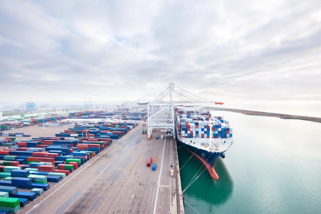


Dos and Don’ts
Below are visual guardrails for how photography appears across our brand ecosystem. Use airy, light-filled compositions with plenty of negative space, unscripted and authentic movement, and environments that feel genuinely attainable. Avoid lens flare, overly staged setups, clearly AI-generated images of transportation modes or people, and dark or muted photography.



Headshots
Use headshots to promote event speakers. In order to unify headshots with varying quality and backgrounds, we apply a consistent light neutral background: Sky Blue. This background choice aligns with the visual brand system.
If an available headshot is professionally shot on a simple, textured background, it can be used as is. So long as the full set of headshots in the composition are harmonious together, it does not need to be placed on the unifying Sky Blue background.

Data Visualization
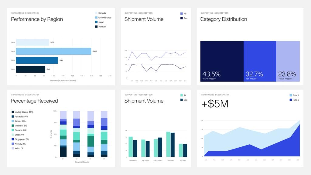
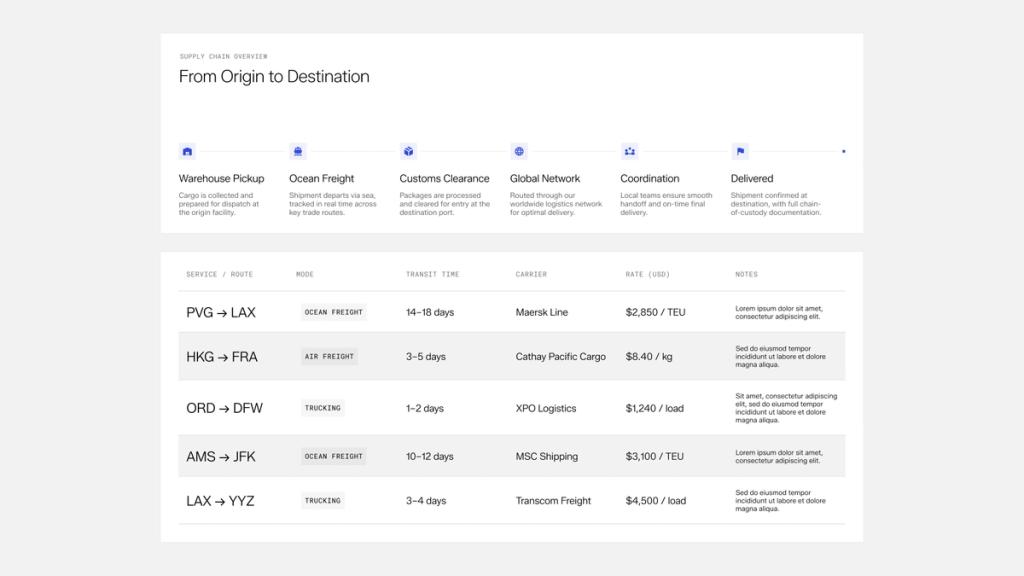
Whether in a presentation, a dashboard, or a report, Flexport's data visualizations — including tables, charts, and timelines — deliver a clean, contemporary aesthetic that uses our signature typography and brand colors.
Graph and table examples
Graphs bring data to life. Always use our typography and brand colors to keep values clear at a glance. For graphs with 6 or fewer data sets, we can use a monochromatic or multicolored palette. For 7 or more, a multicolored palette is recommended — the extra range helps distinguish each data set.
Tables are for structured comparison. Set headings in Zalando Sans, keep column widths consistent, and use our light dividers to guide the eye across rows without cluttering the layout.
Pixel Generator
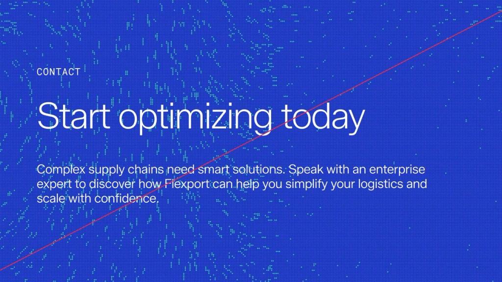
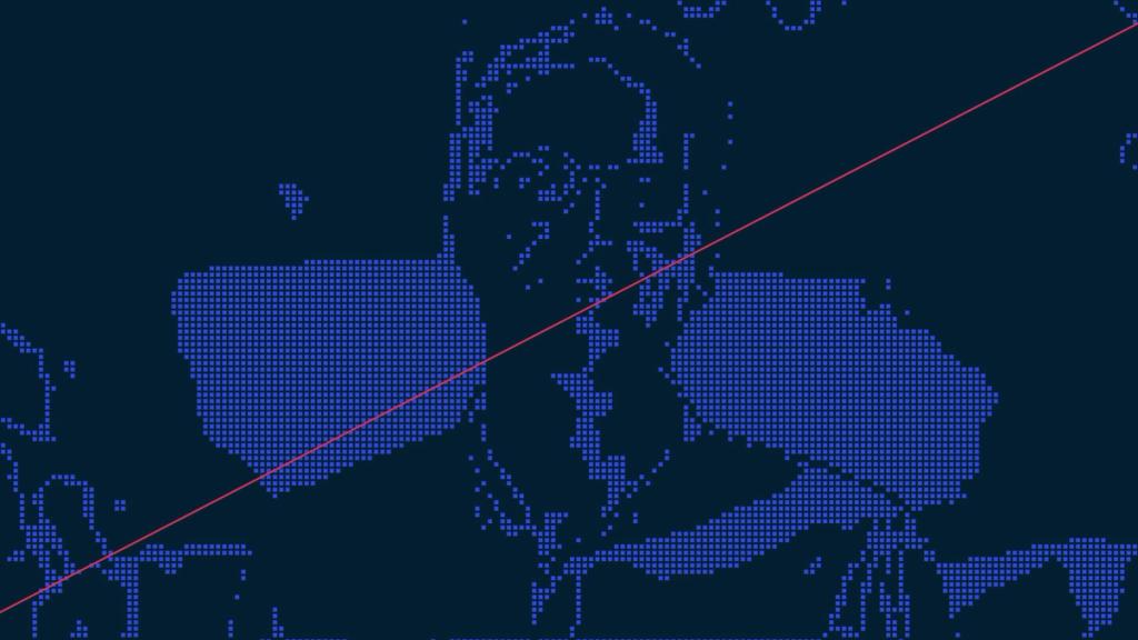
Flexport's design team uses a web-based tool to produce dynamic brand textures — from particle-mapped imagery to looping animations of global transit corridors. Assets are available in static, motion, or interactive formats for digital platforms, social channels, and large-scale presentations. See below for a summary of the tool's four key modes.
Access to this tool is limited to Flexport's design team and approved brand partners.
Image
Applies our particle texture to any uploaded image.
Video
Applies our particle texture to any uploaded video.
Flow Field
Generates a looping animation of particles that mirror global trade routes.
Globe
Generates a world map in our particle texture — used to mark Flexport office locations worldwide.
Our Presets
All assets produced with this tool use one of our defined presets under 'Apply a look'. Each preset has been crafted in our brand colors and tuned to visualize free-flowing global trade. They work as dynamic brand textures — either as stills or as slow, ambient videos in digital environments. Any color combination outside these presets must use only defined Flexport brand colors.
Flexport Midnight uses Midnight Blue 500 as the base swatch with Indigo 600 as the highlight. Flexport Indigo uses Indigo 700 with Seafoam 600. Flexport Gradient combines the Flow Field texture with the brand gradient and is used most prominently in our footer. Flexport White uses Cloud White with Indigo 600.




Dos and Don’ts
Below are visual guardrails for how 'Flow Field' assets appear across our brand ecosystem. Don't speed up the animation — use the speed built into the presets. Don't place live text directly on the animation — use our glass panel treatment to separate text and animation. Don't map particles onto people or lifestyle imagery — use real-life photography for those.
Product Visualization
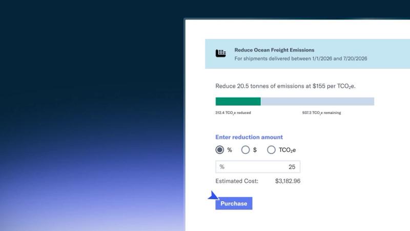
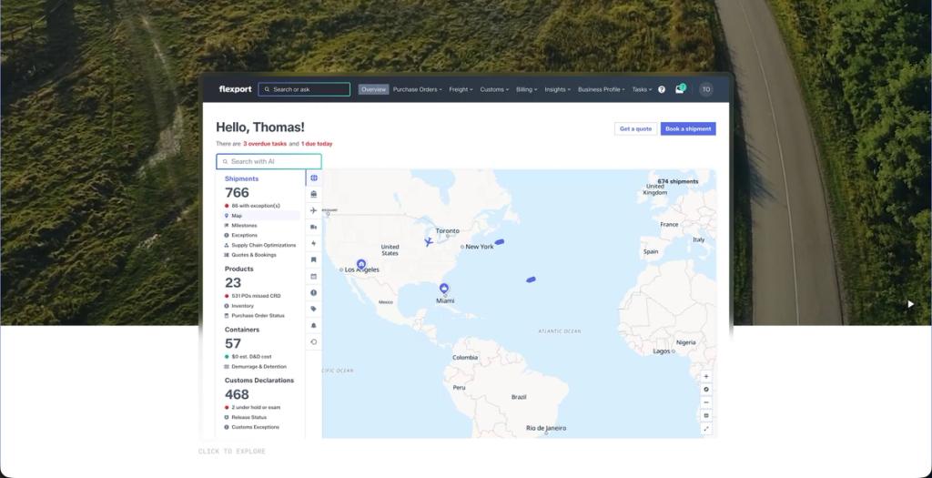
Our UI asset library includes two core presentation styles: a Full Product View enclosed in a sleek glass frame for broad, contextual showcases, and a Condensed Animated View tailored for web performance. The web version highlights isolated product interactions through subtle motion to make complex features instantly understandable.
Brand in use

Conferences
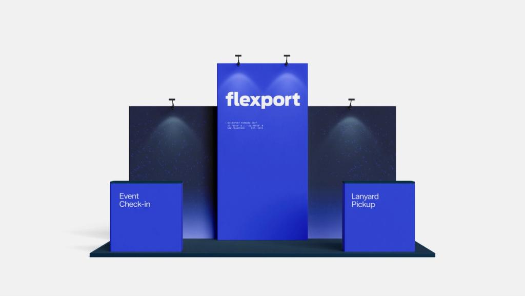
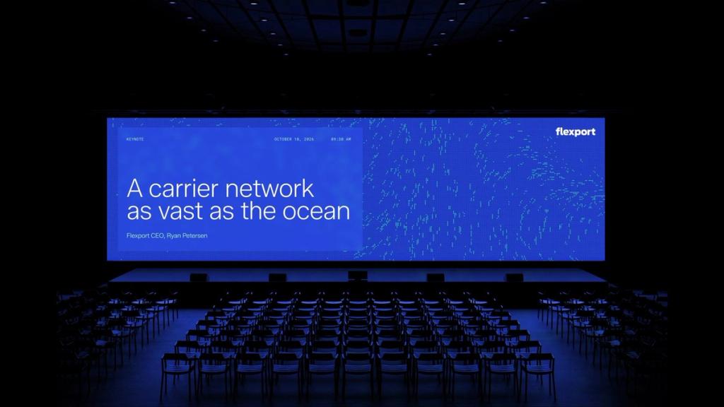
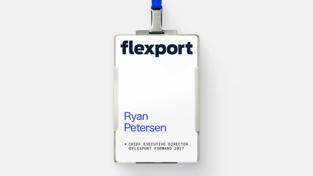
Elevate the Flexport event experience with evergreen collateral featuring contemporary typography and ASCII artwork for major keynotes, paired with industrial, metal lanyards for a premium arrival experience.
Merchandise
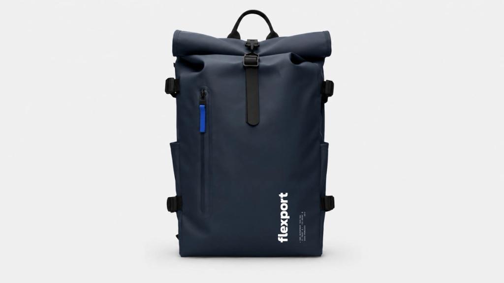
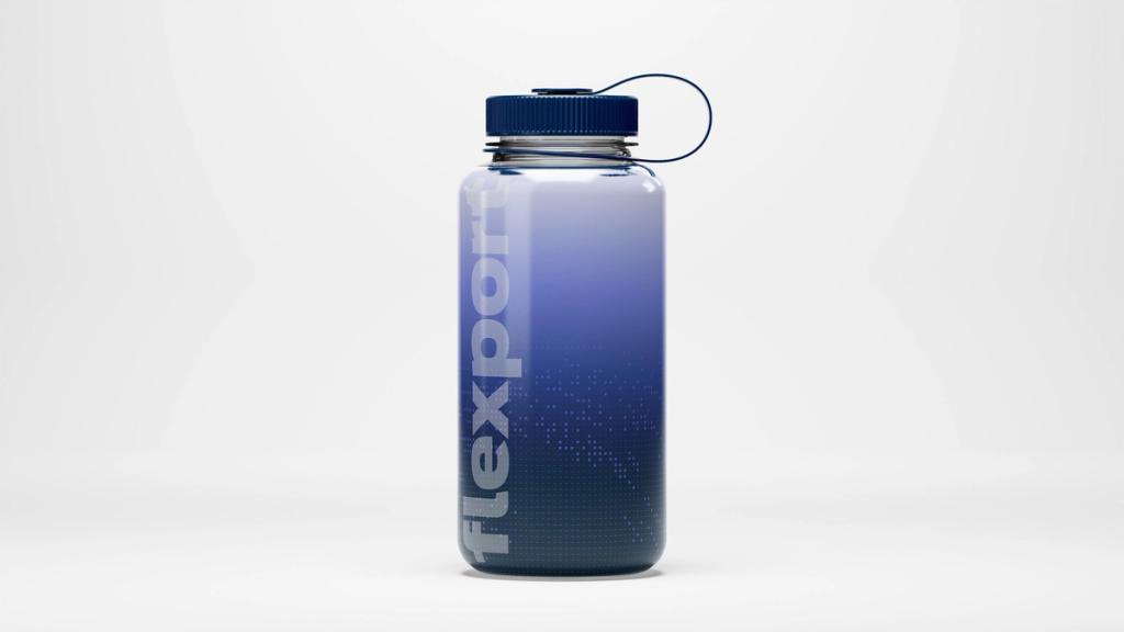
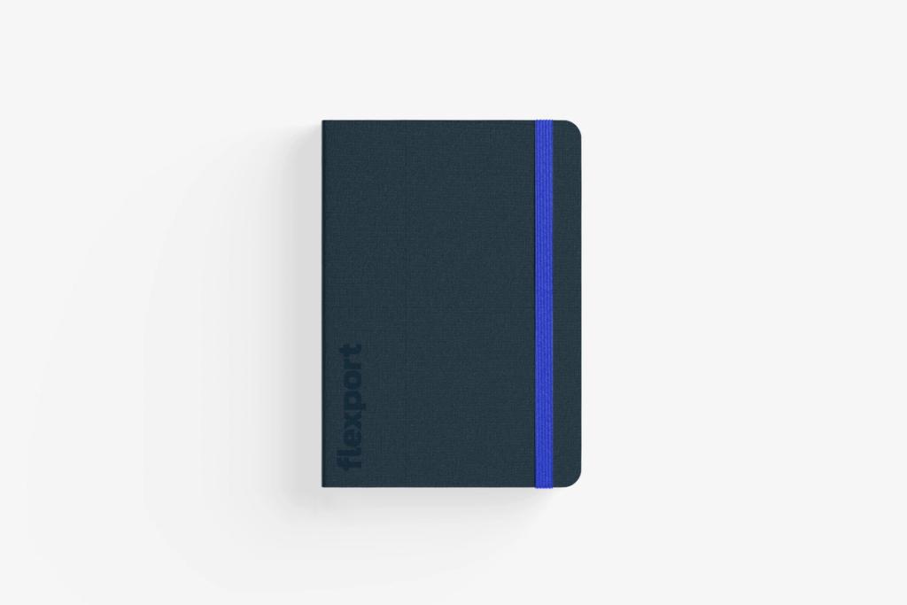
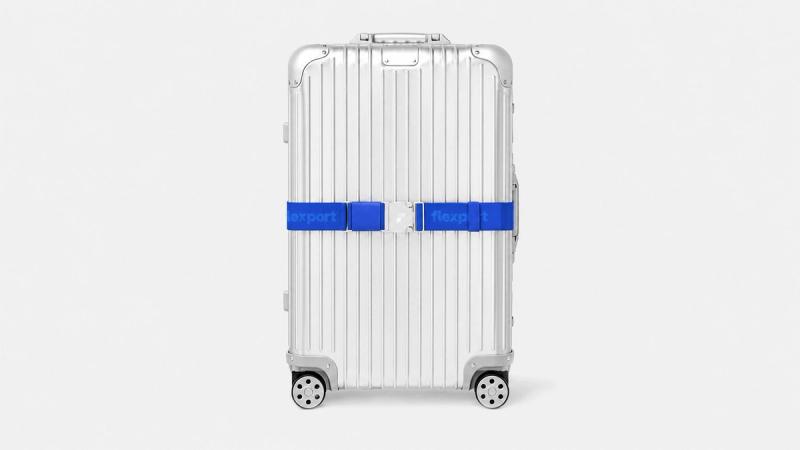
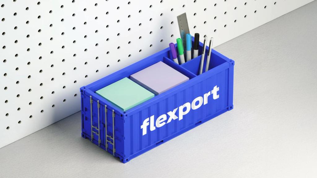
Flexport merchandise reflects our core values and aligns seamlessly with everything we do, from technical waterproof travel bags, luggage straps, recycled plastic storage and notebooks. Every premium item features intentional brand placement, enhanced by our subtle micro-mono typeface.
Social Media
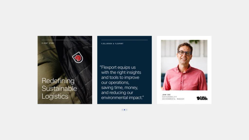
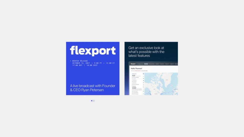
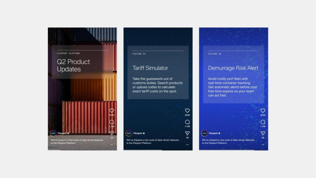
Flexport’s social media blends clean, contemporary design with short, sharp copy, utilizing dynamic imagery and video to reflect our core brand values. The examples below feature a client story, promote a live broadcast and new product features.
Questions? Requests?
Questions or requests about the Flexport brand? Submit a ticket to the Brand Team.